Lorem ipsum dolor sit amet, consectetur adipiscing elit. Ut elit tellus, luctus nec ullamcorper mattis, pulvinar dapibus leo.
Lorem ipsum dolor sit amet, consectetur adipiscing elit. Ut elit tellus, luctus nec ullamcorper mattis, pulvinar dapibus leo.
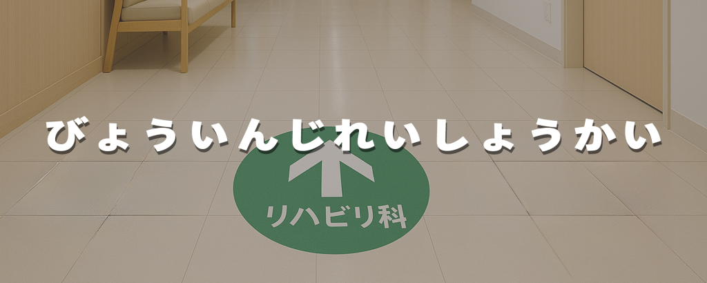
Hospitals often face challenges due to complex layouts and heavy patient flow. To address this, Jiangbo Signage implemented a color-coded wayfinding solution for a Japanese hospital:
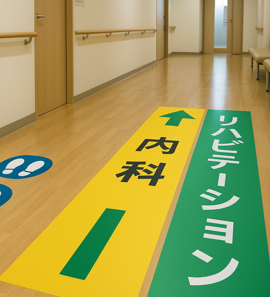
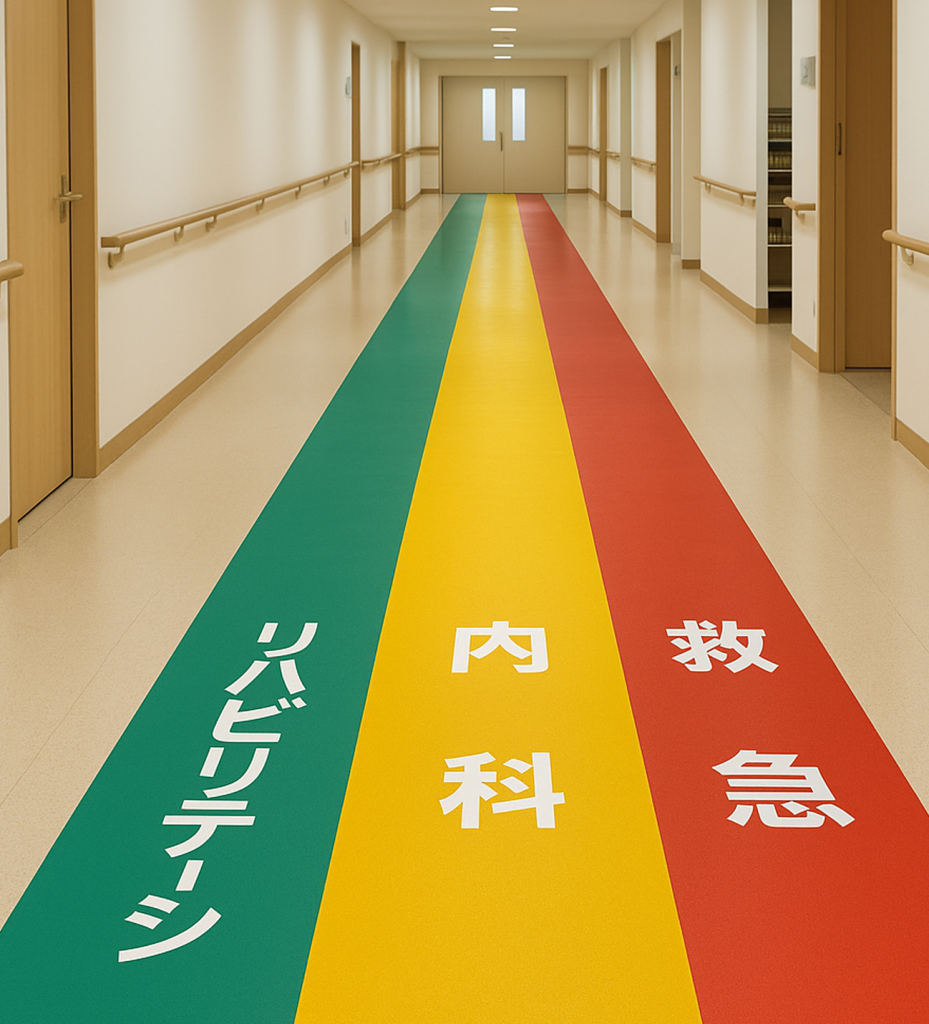
1. Multi-Color Zoning Red, yellow, and green lanes were applied to corridors, labeled directly as “Emergency”, “Internal Medicine”, and “Rehabilitation”. The bold colors and large fonts allow patients and visitors to quickly identify directions and reduce confusion.
2. Precise Guidance At corridor intersections, arrows and footprint icons combined with bilingual signage guide patients effectively, minimizing congestion and stress.
3. Safety and Durability Stickers are made with anti-slip, wear-resistant, eco-friendly materials, ensuring clarity and safety in high-traffic environments, while remaining easy to maintain.
This project demonstrates how Jiangbo Signage improved visualized hospital wayfinding, creating a more efficient, safe, and patient-friendly medical environment.